How We're Reimagining Admissions

Since the CATLab is a dynamic program that brings together talent from across disciplines and departments, it’s not always clear to people outside the program what our developers are actually building. This summer, our goal is to make it possible for high school students to apply to Westmont through a custom application process. We’re improving both sides of the process—externally, improving the user experience for high schoolers; and internally, improving the way for admissions counselors and officers to process those applications.
Last summer, we made some great progress towards cleaning up the internal process—helping out our admissions workers by creating better layouts and components. (Salesforce defines components as “small, reusable pieces of functionality—think widgets, panels, user interface elements, that kind of thing”). We built an Application Overview page, which allows admissions counselors to see all the relevant information for an applicant in one page, rather than having to chase down data all across the database. We also started combining our previously siloed data into one big organization. This summer, we’re putting the finishing touches on those projects and completing our custom application portal. Here’s a rundown of the improvements we’re bringing:
1. Creating an elegant, modern application portal

The most public change we’re making is building a completely new application portal that allows us to do everything we want, the way we want. Building on the baseline of Salesforce communities, we’ve been able to customize everything from the color scheme to the way accounts are created and email addresses are verified. The Salesforce platform is built to be customized to an organization’s specific needs, meaning our developers have access to Salesforce-provided layouts and processes as a baseline for projects.
One of the improvements we’re working on this summer is “creating a more user-friendly login experience,” said our developer Jordan. She has been designing the UX/UI of the login flow, which basically means making sure the login process walks users through in a logical way. She’s also been putting her design skills to good use by creating pop-ups and modal windows that guide the user through the experience.
Another example of how we’re modernizing the application is building forms with conditionals. Conditionals, like their name suggests, only occur if certain conditions are met. In the case of our forms, it means that certain sections of a form only display if they’re relevant. For example, selecting a box asking if you attended multiple high schools might make a text box appear so you can enter the names of those schools. Having the form change based on what the applicant needs cleans up the look and also makes it easier to use.
2. Adding mobile accessibility to that portal

It’s simple enough to have a list view or table for a computer, but what do you do when you need to get that same information to display on a device with a very limited screen size? Shown here is the recommendations component that senior developer Nathan has been working on. He and John collaborated on implementing the mobile paging that allows for this convenient view. Although John describes this work as mainly “cosmetic,” it’s actually incredibly important. For students whose only way to apply to college may be on their phone, it’s crucial that they be able to see and interact with all the features properly.
3. Providing personalized feedback so applicants understand the process
Something our senior developer Nathan highlighted about our goal this summer is that keeping students informed means less confusion over requirements and therefore less work for our Admissions team. Even something as simple as color-coding can help convey information at a glance. The transcript page above shows what Westmont requires and what it has received. Additional pop-ups provide even more information.
Similarly, the app header displays information based on a student’s attending term, whether or not the application is current, whether the student is a first year or transfer, and so on. This component also “gives students the ability to edit their application type or term from right inside the portal itself.” According to Talia, who developed it, the app header allows “the student to have more control over their application and a better understanding of what the status is of their application.”
Another component, the submit button built by Nathan, “takes care of a bunch of potential slow-downs” by verifying that the application has complete and accurate data before it can be turned in. This helps our applicants know what they need to do. It also means our counselors don’t get as many calls or complaints about the process and can instead focus on cultivating relationships with students.
Now that we’ve talked a little bit about how we’re helping prospective students, it’s time to shift focus to how the CATLab is helping expedite the admissions process from the administrative end.
4. Bringing all our internal data into one place

Westmont used to have two sets of data: one for Admissions, dealing with prospective students; and one for Advancement, dealing with alumni and donors. In the last couple of years, however, we’ve been working to bring these two sets of data into one. Why? Combining databases means less work and more insights. It’s now possible for us to follow someone through their whole involvement with Westmont—from the first time they fill out an information card or participate in a summer camp to their graduation from college and their legacy as an alumni.
Our data team’s first task this summer was setting up the field mappings, which basically form a giant table that makes sure data is transferred or added to the correct slots. As one of the team leads said, “Knowing where the data lives is the first step in being able to use it well.” Developer Kristen shared that the team finished this project within a matter of days—much faster than we could have hoped for! The next step, data loading, is harder to collaborate on, so as Kim has tackled that, the rest of the team has moved on to new projects.
5. Making it easy to view, understand, and use that data

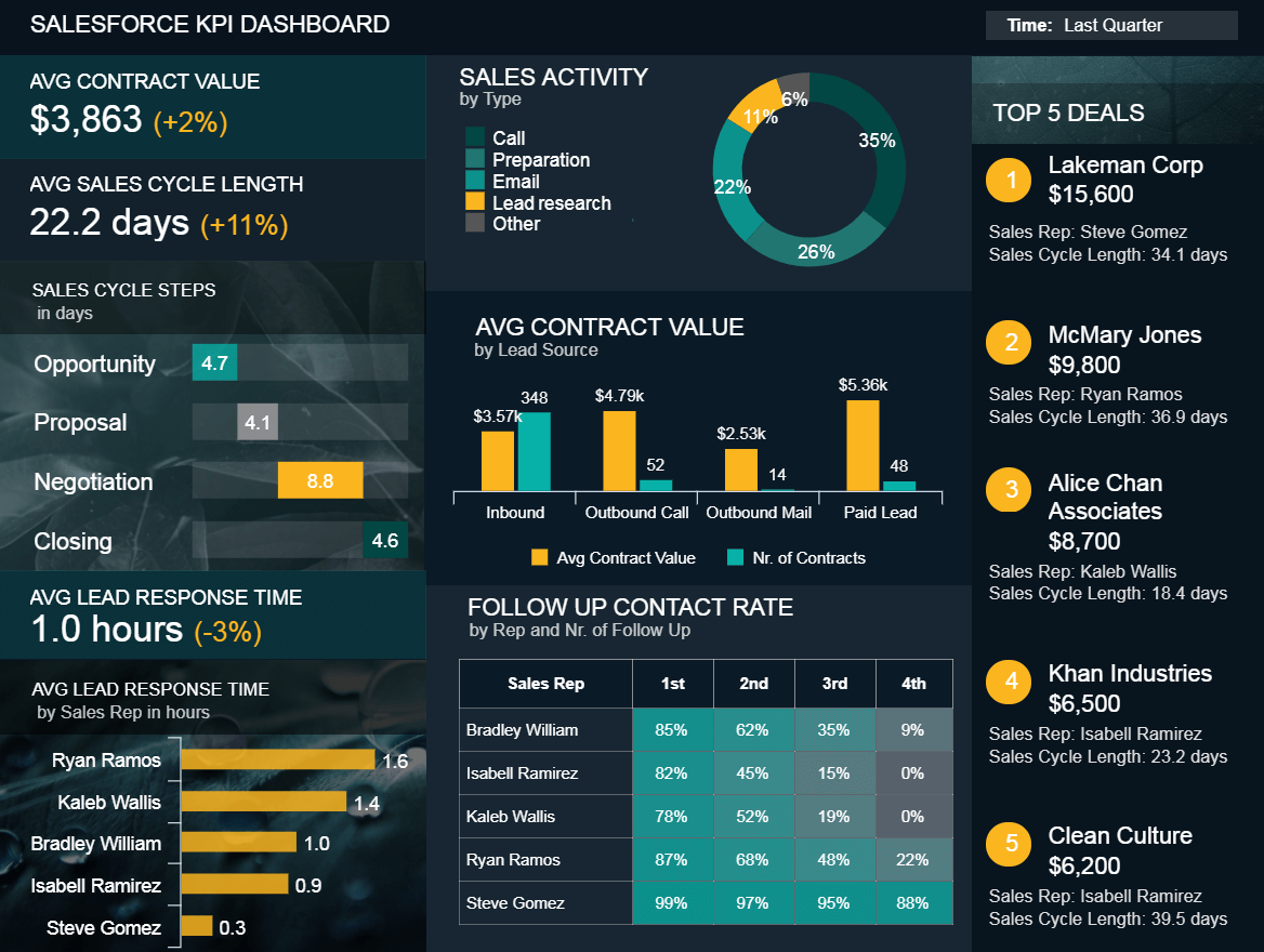
Kimberlee, Ben, and James have all been working with Einstein Analytics, a Salesforce tool, to make sure data is displayed meaningfully and used to drive decisions. As you can see in this example dashboard from datapine.com, data can be visualized in a variety of different ways to get nuanced overview of the information available. Senior developer Ben explains it this way: “Einstein Analytics is built around the idea of dashboards and charts, basically utilizing the data to create valuable insights.”
Some problems he’s looking forward to solving include helping the college identify things like “what kind of students are going to commit to Westmont, what kind of students are going to stay here for four years, what kind of students are going to contribute to the college and be active in the community after they graduate.” That way, Admissions counselors can focus on the most promising leads and have an idea much earlier on whether a student will be a good fit for Westmont—and vice versa.
6. Expediting data updates and use

As we’ve been essentially rebuilding everything Admissions needs to run, our goal is not just to replicate what they had before, but to make it better. We can do that by creating more efficient ways for counselors and officers to carry out common tasks. Pictured above is part of the Life Event component that Hannah has been working on this summer. This component allows a worker to “make many changes to the database in a simple use interface.” The “graduate” life event, for instance, automatically updates a student’s education information, constituency, and so on. This automation helps with both efficiency and data integrity.
On a similar note is the Quick-Entry Form, a custom search component that modifies itself to the user and their set of permissions. It’s more efficient than the regular search because it only pulls information from records stamped with the “prospective student” constituency. The real beauty of it, as James said, is “you’re not jumping around to different pages, to different object layouts—you’re clicking one button on one page.”
Finally, the Application Overview is the component that pulls together all the relevant information for a given application into one page. Sophia, our team lead, emphasized that this component “represents the work of many people.” This single page does much of the heavy lifting when it comes to how Admissions counselors use Salesforce in their everyday work.
In the short, then, we are tackling the issue of admissions from all sides: We’re creating a better experience for people applying, better procedures for our institution to process applications, a better quality of interactions, and better ways of harnessing our data. Here at the CATLab, we’re developing technology to make the whole admissions process the very best that it can be.
Follow us on social media to learn more about innovation at the CATLab!